Introduction to Esperanto Symbols
Esperanto symbols are the visual and cultural markers that define one of the world's most successful constructed languages. These symbols range from the distinctive letters and diacritics that make Esperanto unique to the cultural icons that unite a global community of speakers.
If you've encountered Esperanto online or in person, you've likely noticed the green star flag or the special characters like "c with a circumflex" that set this language apart from others. But what do these symbols actually mean, and why do they matter so much to the Esperanto movement?
Understanding Esperanto symbols is crucial because they represent far more than just linguistic markers. They embody the philosophy behind Esperanto itself: a language designed in 1887 by L.L. Zamenhof with the goal of fostering peace and understanding across cultures.
The standardization of Esperanto's script and symbols happened gradually as the language evolved from a personal project into a living, breathing community with speakers across the globe. Today, these symbols serve as identifiers for a movement committed to multilingual communication and cultural bridge-building.
In this post, you'll learn how to recognize, type, encode, and even design with Esperanto symbols. By the end, you'll have a comprehensive guide to the symbols that make Esperanto instantly recognizable and culturally significant.
The Esperanto Alphabet and Its Unique Symbols
The Esperanto alphabet consists of 28 letters built on the Latin script, making it accessible to speakers of English and other European languages. Unlike English, which has 26 letters and relies heavily on irregular pronunciation rules, Esperanto maintains a strict one-to-one correspondence between letters and sounds. This phonetic consistency is one of the language's greatest strengths and a key reason why learners can progress quickly.
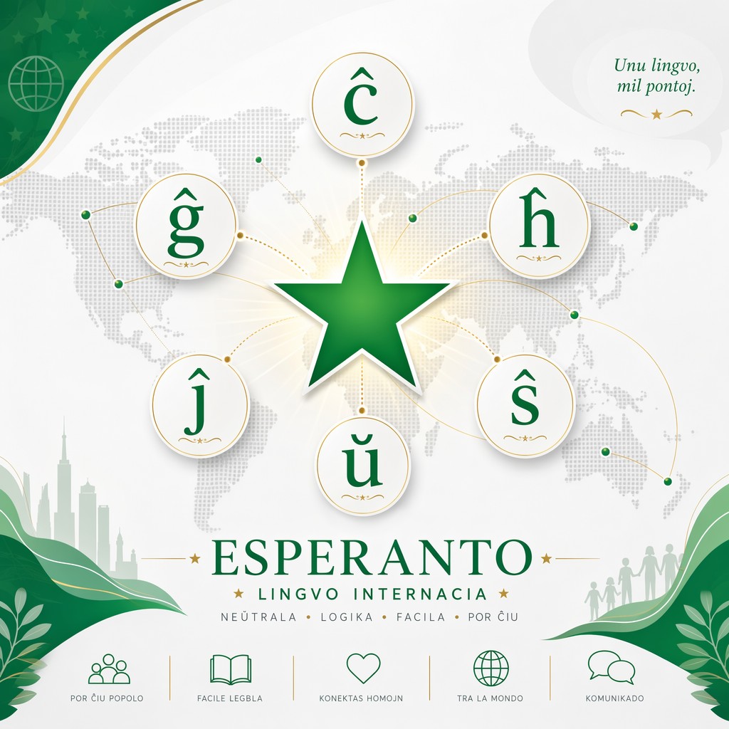
However, what truly sets Esperanto apart are its six special letters with circumflexes and one letter with a breve, which represent sounds that don't exist in English.
The six circumflexed letters are ĉ, ĝ, ĥ, ĵ, ŝ, and ŭ (which actually uses a breve rather than a circumflex). Each serves a specific phonetic purpose.
The letter ĉ sounds like the "ch" in "church." The ĝ resembles the "j" in "judge." The ĥ is pronounced like the "ch" in German "Bach," a guttural sound that many English speakers find challenging at first. The ĵ sounds like the "s" in "measure" or the "zh" in Russian. The ŝ is similar to the "sh" in "ship." Finally, ŭ is a consonant that functions like the "w" in "way," not a vowel despite its appearance.
When pronouncing these accented symbols, consistency is key. One common pitfall for English speakers is treating ĉ like a "k" sound instead of "ch," or mispronouncing ĝ as a hard "g." Another frequent mistake involves the ĥ, which English doesn't have as a standalone sound, causing learners to either skip it or replace it with "h." The ŭ also trips up newcomers who assume it's a vowel based on its appearance.
Practicing these sounds in isolation, then within words, helps embed the correct pronunciation into your muscle memory. Once you master these seven special letters, you'll unlock the phonetic precision that makes Esperanto such an efficient language to learn.
Diacritics Explained
Diacritics are the small marks placed above letters that fundamentally change how a letter is pronounced in Esperanto. The two main diacritical marks used in Esperanto are the circumflex (^) and the breve (˘). These marks are not decorative elements or optional flourishes. Instead, they are essential components of the language's phonetic system, distinguishing phonemes that would otherwise sound identical or confusing.
Without these diacritics, the Esperanto alphabet would lose the precision and clarity that makes it so effective for international communication.
The circumflex and breve serve a critical function in differentiating pronunciation and, consequently, word meaning. For example, without the circumflex on ĉ, the letter c would be pronounced like the "ts" sound in "cats." Similarly, the breve on ŭ distinguishes it from u, which is a vowel pronounced like "oo" in "moon." This distinction matters because in Esperanto, using the wrong diacritic or omitting it entirely can change the meaning of a word or make it unrecognizable.
The language's designers understood that clarity requires precision, so they built diacritics into the core structure rather than treating them as optional additions.
Other Esperanto Symbols and Cultural Icons
Beyond the alphabet and diacritics, Esperanto has developed a rich collection of visual and cultural symbols that represent the movement's values and identity. The most iconic of these is the green five-pointed star, which has become synonymous with Esperanto worldwide. This symbol originated in the early days of the Esperanto movement and carries deep meaning rooted in the language's founding philosophy.
The green color represents hope and growth, while the five points symbolize the 5 continents, reflecting Esperanto's mission to connect people across the globe regardless of geography or cultural background. You'll find the green star on flags, badges, pins, and countless other items that Esperantists wear and display with pride.
The Esperanto flag (Esperanto-flago) itself exists in several designs, with the most recognizable being the green flag featuring the white five-pointed star in the upper left corner, similar to the layout of many national flags. This design became the official flag of the Esperanto movement and is displayed at international Esperanto conferences and events.
Beyond the standard green flag, there's also the jubilee flag, created to commemorate special occasions and anniversaries within the movement. Regional variations exist as well, with different Esperanto organizations and groups sometimes incorporating local elements or colors while maintaining the core green star symbolism. These variations reflect how Esperanto adapts and evolves while staying rooted in its original mission.
The cultural symbols of Esperanto extend to the movement's anthem, "La Espero" (The Hope), which encapsulates the idealistic spirit of the language. This hymn is performed at major Esperanto gatherings and serves as a unifying force for speakers around the world.
Besides the anthem, numerous logos and organizational symbols represent different facets of the Esperanto movement, from youth organizations like Esperanto Youth Organization (TEJO) to professional associations and regional groups. Each symbol tells a story about how Esperanto has grown from Zamenhof's original vision into a global community with its own traditions, celebrations, and visual identity.
Understanding these symbols gives you insight into the heart of the Esperanto movement and the community you join when you begin learning the language.
Encoding and Display
If you've ever tried to type or display Esperanto online, you've likely encountered encoding challenges. Unicode is the universal standard that allows computers to represent and display characters from languages around the world, including Esperanto's special symbols. Each Esperanto letter with a diacritic has a unique Unicode code point that tells your device exactly how to render that character.
For example, the uppercase Ĉ has the Unicode code point U+0108, while the lowercase ĉ is U+0109. Understanding Unicode is essential for anyone working with Esperanto digitally because it ensures that your text displays correctly across different devices, platforms, and applications. Without proper Unicode encoding, Esperanto text can appear as garbled characters or question marks, making it unreadable and frustrating for both writers and readers.
For web developers and content creators, HTML entities provide a practical way to insert Esperanto characters into web pages. HTML numeric references allow you to use Unicode code points directly in your code. For instance, you can type "Ĉ" to display Ĉ, or "ĉ" for ĉ. Named entities also exist for some Esperanto characters, though not all of them have standardized names like common symbols do. These methods ensure that your Esperanto content displays correctly even if a visitor's keyboard or system doesn't have native support for these special characters.
Font compatibility represents another critical consideration when working with Esperanto symbols. Not all fonts include glyphs for Esperanto's special characters, which can result in missing or substituted characters on websites and in documents. For web use, web-safe fonts like Arial, Verdana, and Georgia generally support Esperanto diacritics, though you should always test before publishing. For more specialized needs, fonts like "Gentium" or "DejaVu Sans" are specifically designed to include comprehensive Unicode support, including all Esperanto letters.
When designing print materials, fonts such as "Liberation Sans" or "Noto Sans" ensure that your Esperanto text reproduces cleanly and professionally. Testing your content across different browsers and devices before sharing is essential to guarantee that your audience sees your Esperanto symbols exactly as you intended them to appear.
Typing Esperanto Symbols
Typing Esperanto symbols can seem daunting at first, especially if your standard keyboard doesn't have dedicated keys for circumflexes and breves. Fortunately, multiple solutions exist across different operating systems and devices.
On Windows, the most popular solution is a program called Tajpi that allows you to type Esperanto symbols using special key combinatons like typing "c" + "x" to write ĉ. macOS users can use the free menu bar app called Klavaro tha automtically convert x and h combinations into proper Esperanto leteters.
For mobile devices, iOS and Android both have native solutions and the process is more or less the same. For Android users, the simplest way is to enale the Esperanto keyboard in Gboard settings. iPhone users can go to their keyboard settings and add Esperanto as a new keyboard.
Before modern technology made typing Esperanto easy, two practical workarounds emerged: the X-system and the H-system. The X-system replaces circumflexed letters with their base letter followed by an "x," so ĉ becomes "cx" and ŝ becomes "sx." The H-system does something similar, using "h" instead of "x," transforming ĉ into "ch" and ŝ into "sh." Both systems have pros and cons worth considering.
The H-system came out first and was recommended by Zamenhof himself. However, it can create readability issues and ambiguity. The X-system is less ambiguous and more systematically consistent, but it looks less natural to the eye and can seem awkward to write. From a searchability perspective, neither workaround is ideal because search engines won't recognize "cx" as equivalent to "ĉ," limiting discoverability of your Esperanto content.
Modern technology has largely eliminated the need for workarounds through browser extensions, input tools, and mobile apps specifically designed for Esperanto. Extensions like "Esperanto X-system converter" for Chrome and "Ektajpu" for Firefox allow you to type Esperanto symbols by using the x-system. Once you've configured your preferred input method, typing Esperanto becomes effortless, allowing you to focus on learning, creating content, and connecting with the global Esperanto community without technological barriers holding you back.
Design and Typography
When designing materials that feature Esperanto symbols, presentation matters as much as accuracy. Diacritics are small marks, and if they're not displayed with proper care, they can become invisible or clipped, undermining the credibility of your work and confusing your audience.
In headings and logos, ensure that your chosen font renders diacritics clearly and that there's adequate space above the letters to prevent the circumflex or breve from disappearing. Test your designs across different browsers, devices, and print outputs before finalizing anything. When working with print materials, consult with your printer about font compatibility and resolution settings to guarantee that Esperanto symbols reproduce with precision.
The stakes are highest when creating logos or branding materials, since these represent your commitment to the language and the movement. A poorly rendered circumflex can make an otherwise professional design look careless.
Technical typography details become critical when presenting Esperanto at scale. Kerning, which controls the spacing between letters, can inadvertently create problems with diacritics if not configured properly. A tight kerning setting might cause the circumflex on one letter to overlap with an adjacent letter, reducing readability.
Similarly, line-height (the vertical space between lines of text) must be generous enough to accommodate diacritical marks without clipping them off. This is especially important in web design, where default line-height settings can sometimes be too tight for languages with diacritics.
Fallback fonts also play a crucial role. If your primary font doesn't support Esperanto characters on a user's device, your fallback font must include them. In your CSS, structure your font stack strategically, listing fonts with comprehensive Unicode support early in the chain so that Esperanto text degrades gracefully rather than displaying as boxes or question marks.
Accessibility is another essential consideration that often gets overlooked. Screen readers, which assist visually impaired users, must be able to recognize and pronounce Esperanto diacritics correctly. Including a lang="eo" attribute in your HTML code tells screen readers that the content is in Esperanto, improving pronunciation accuracy.
Providing transliteration options or alternative text representations can help users with assistive technologies while also benefiting those on devices with limited font support. If your website or document includes extensive Esperanto content, consider offering both the properly diacriticked version and a transliterated version using the X-system or H-system as fallbacks. This dual approach ensures that your content remains accessible to everyone while maintaining the integrity of the Esperanto symbols.
By implementing these design and accessibility practices, you demonstrate respect for both the language and your audience, creating an inclusive experience that welcomes learners and speakers at all levels of technical comfort.


0 comments